


|
Wordsearch statistics
This page shows the usage of the Wordsearch program from a number of points of view.
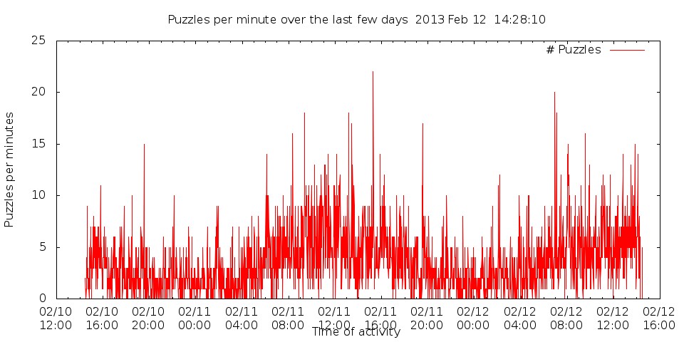
The first graph is the number of puzzles per minute. This shows how the usage is split out over the day.
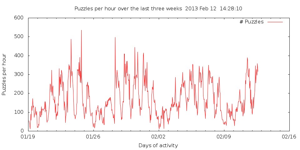
The following graph shows the usage, per hour, over the last three weeks. Current time is to the right. The vertical axis shows the number of puzzles generated per hour, and the horizontal axis shows the date.
It is clear that this follows a daily cycle, indicating that most of the use is in the "daytime" of the western hemisphere, probably the USA.
This also shows a weekly cycle, with less activity on weekends, and more on weekdays. This program is used for school (teachers and students), and the weekdays are when they do things.
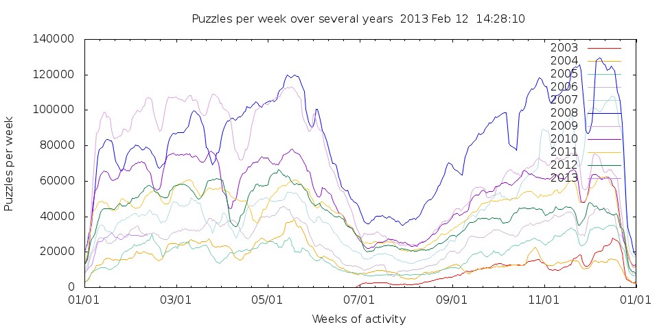
Looking at the daily graph shows the weekly cycle. Each hump during the school year is a week of activity, and the low periods are the weekends where the puzzle doesn't get used as often as during school days.
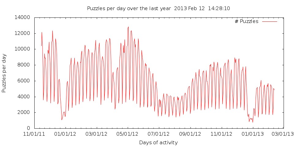
This graph shows the school year. When school is in session we will have a much more activity then in the the summer and Christmas. There were 3,236 puzzles made today (so far), 128,496 puzzles made in the last month, and 2,022,572 puzzles made in the last year.
As you can see, each year's profile is much like previous years. With growth, the more current years will be above the earlier years.
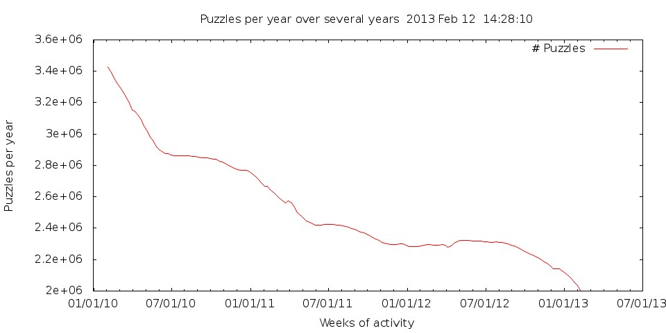
The yearly graph shows the puzzles made in the previous 52 weeks, for each week. This should filter out all of the fluctuations made over a school year, and should represent the growth, or decline, of the site.
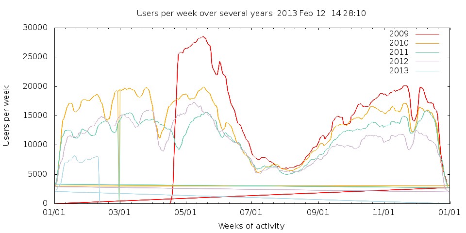
The user graphs shows the number of distinct users per day summed over the previous week. Again, the week based filter should filter out the daily variation.
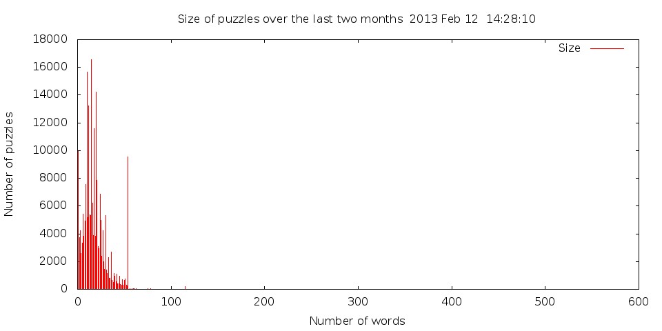
People make puzzles with different numbers of words. The following shows the size puzzles people make over the last two months.
The curious spike at 54 is because the basic form for filling out words has 54 entries. Lots of people feel compelled to fill the entire form. Other spikes tend to form at 1, 10, 15, and 20 words. The spike at 1 is just people ensuring that things work. The other "nice" numbers is because people like that number of words. Other than a few special numbers, the rest is a nice curve.
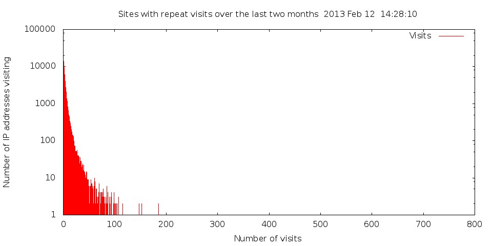
The next graph is not particularly informative. This attempts to show repeat activity. As expected, most IP addresses only create a few (less then 30 or so) puzzles. There are only so many puzzles that a person can create. At the right of the graph, there are a few IP addresses that visit thousands of time. But there is only one IP address with a specific count, so the data point is down on the axis. These IP addresses are proxy sites for places like aol.com.
It's not clear how to make this data meaningful with a graph.